
Images and Logo
The band is represented as a cool, lively band as shown in the centre image of the band playing live.
New Technology & Links
The band use loads of links to give the viewer easy access to information on tours, news on the band and a link to their shop. This helps in their promotion because it helps their promotion spread and their fan base grow due to the possibility of becoming a member of the site and so feeling like part of the group.
Written Content
There is only a little bit of writing on the site and that is just the links to other parts of the webpage, the writing that is shown is in the style of Arctic Monkey’s logo. The style is very formal which represents the image the band put across.
Target Audience
They use stylish pictures and a fancy overall design that grabs people’s attention.
Genre
They show a style of images that represents the genre as it includes the band performing, a very basic page with not many colours used and just a centrepiece image.
Colour & Style
The colour of the site is very basic as it is only got black and white background with one bright colourful picture in the middle of the band performing.
Font and Layout
The font follows the style shown in the Arctic Monkey’s logo and the style of the website seems to be very general and easy to access for the fans as well as trying to put across this very indie and cool look that the band are trying to achieve.
Advertisements
There aren’t any advertisements on the front page except for the link to the other areas of the site such as the shop.

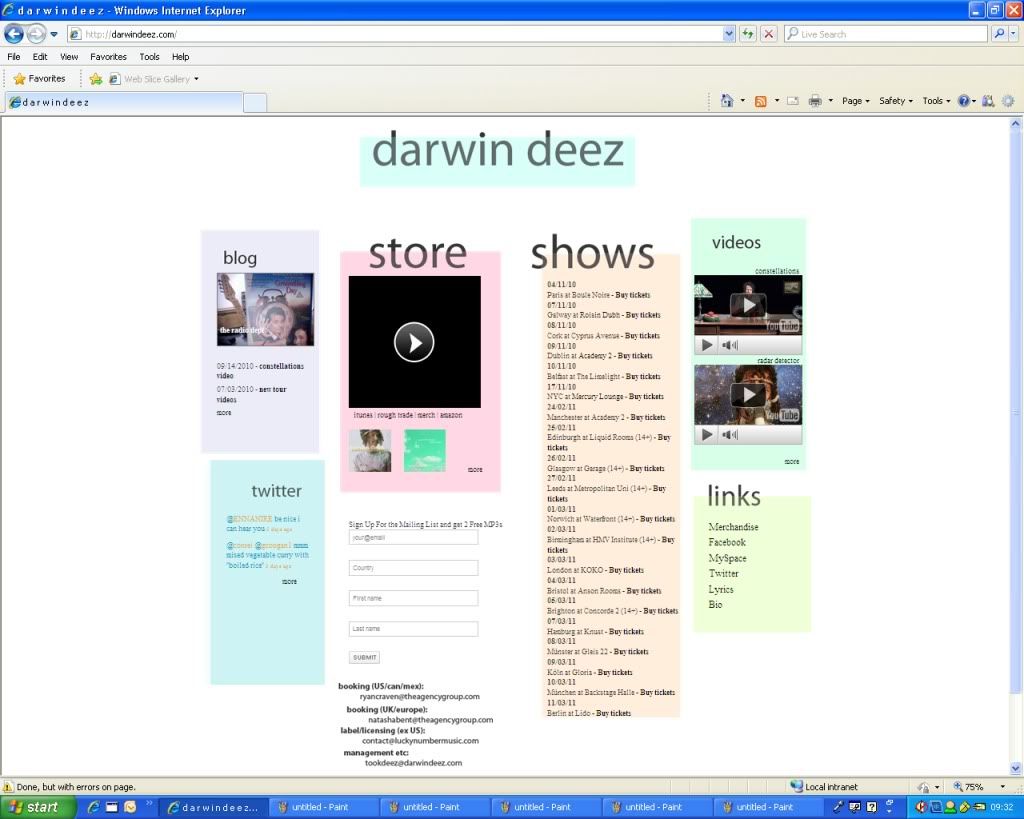
Images & Logo
The website homepage includes a few images of the band’s logo and also a big image of the band’s new album.
New Technology & Links
There is links to other websites such as the social networking website, Twitter, embedded videos from YouTube of the band’s new single and also links to news stories and other areas of the band’s site.
Written Content
The written style is a half formal, half quirky style which represents the image of the band as they like to be serious but also have their funny moments.
Target Audience
The band use funny quotes and up to date technology such as linking in YouTube, ect to keep up with the modern, young audience that they attract.
Genre
The website comes across as very stylish and modern but keeps with the indie feel by just using very basic colour schemes.
Colour & Style
As I previously mentioned the colouring used on the site is very basic but effective plus the bits that are in colour stand out and they are the more important bits for the band such as the new album that they are trying to sell.
Font and Layout
The font and layout of the website follows the font used in the band’s logo. It looks very modern and indie.
Advertisements
The only advertisements on the homepage are to other areas of the website, promoting the band’s new album and song and also links to other sites that the band have content on such as their twitter.
<a href="http://s295.photobucket.com/albums/mm148/brianthelettuce/?action=view¤t=strokes.jpg" target="_blank"><img src="http://i295.photobucket.com/albums/mm148/brianthelettuce/strokes.jpg" border="0" alt="Photobucket"></a
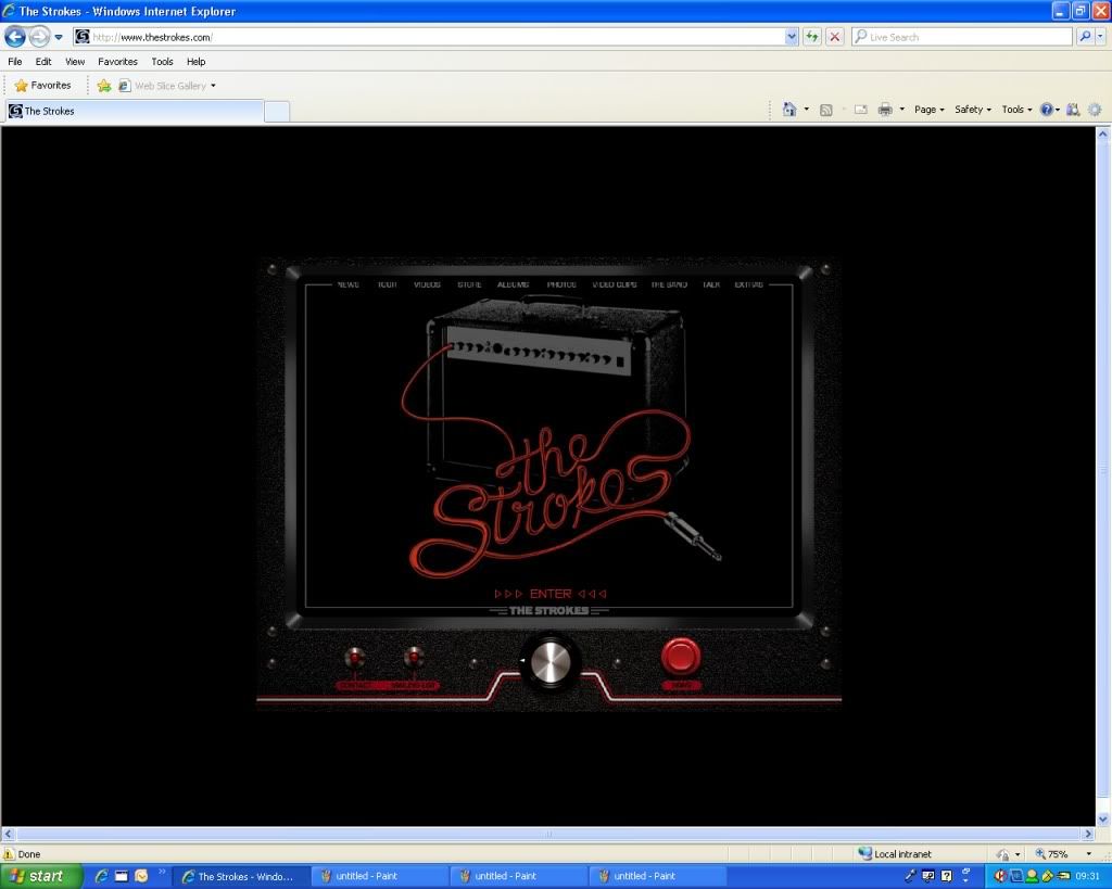
Images & Logo
The band is represented by a big picture of an amp with the wires spelling out the band name in a very futuristic and stylish way; the images come across as very rock and roll’esque whilst keeping the indie feel.
New Technology & Links
There is only a link to the main website of the band as well as a couple of very futuristic looking buttons and pictures.
Written Content
The written content is very minimal and formal as well as being straight to the point which represents the bands straight edge approach to their music.
Target Audience
The target audience will be attracted by the very impressive looking opening with the amp and the band’s name being lit up as wires. It seems impressive and comes across as very cool, just like the band is felt as by the fans.
Genre
The site represents the indie genre well as it shows a very alternative and cool approach to a homepage.
Colour & Style
The site is very dark apart from the glowing name of the band shown on the amp, this really adds to the effect as it singles out on the whole page.
Font and Layout
The layout is very simplistic and straight forward and the font is just a normal standard font, it helps portray the band as a straight forward, bold and simple band.
Advertisements
There doesn’t seem to be any advertisements to anything other than the link to continue on into the site itself.
a href="http://s295.photobucket.com/albums/mm148/brianthelettuce/?action=view¤t=darwindeez-1.jpg" target="_blank"><img src="http://i295.photobucket.com/albums/mm148/brianthelettuce/darwindeez-1.jpg" border="0" alt="Photobucket"></a>
Images & Logo
This is the most straight forward of all the sites, the band don’t even have a logo just a font showing their name. It represents the band as an easy going and simple type of band without all the flash and over the top things other bands have on their sites.
New Technology & Links
The band only really uses embedded videos and a link into their blog and Twitter but apart from that the site doesn’t really use anything else.
Written Content
It is straight forward and very formal, it is just nice and simple.
Target Audience
The very minimalistic approach put across on the site is very nice for the hippy style of the band and because it is so simple it will be very appeasing to the audience they are trying to attract.
Genre
The very light coloured and laid back approach to the site emphasises the type of music they are trying to put across. It fits with the indie genre as it is different and not what you usually expect to find on a band page.
Colour & Style
The style and colour like I keep emphasising is very simple.
Font and Layout
The layout and font follow the same theme set by the band as they are just in a very ordinary font and a simple layout.
Advertisements
The site does not include any advertisements apart from a couple links to the bands other material.
No comments:
Post a Comment